Observação
Clique aqui para baixar o código de exemplo completo
Percentis como gráfico de barras horizontais #
Os gráficos de barras são úteis para visualizar contagens ou estatísticas resumidas com barras de erro. Consulte também o gráfico de barras agrupadas com rótulos ou o exemplo de gráfico de barras horizontais para obter versões mais simples desses recursos.
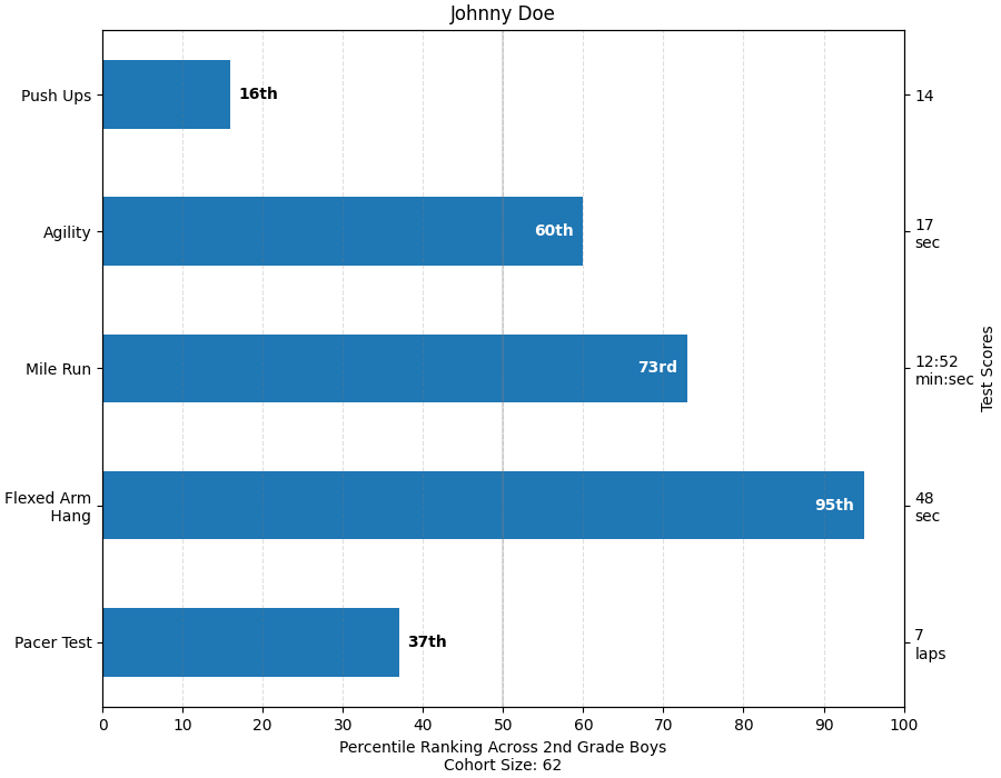
Este exemplo vem de um aplicativo no qual os professores de ginástica do ensino fundamental queriam poder mostrar aos pais como seus filhos se saíram em vários testes de condicionamento físico e, principalmente, em relação ao desempenho de outras crianças. Para extrair o código de plotagem para fins de demonstração, criaremos alguns dados para o pequeno Johnny Doe.
from collections import namedtuple
import numpy as np
import matplotlib.pyplot as plt


Student = namedtuple('Student', ['name', 'grade', 'gender'])
Score = namedtuple('Score', ['value', 'unit', 'percentile'])


def to_ordinal(num):
    """Convert an integer to an ordinal string, e.g. 2 -> '2nd'."""
    suffixes = {str(i): v
                for i, v in enumerate(['th', 'st', 'nd', 'rd', 'th',
                                       'th', 'th', 'th', 'th', 'th'])}
    v = str(num)
    # special case early teens
    if v in {'11', '12', '13'}:
        return v + 'th'
    return v + suffixes[v[-1]]


def format_score(score):
    """
    Create score labels for the right y-axis as the test name followed by the
    measurement unit (if any), split over two lines.
    """
    return f'{score.value}\n{score.unit}' if score.unit else str(score.value)


def plot_student_results(student, scores_by_test, cohort_size):
    fig, ax1 = plt.subplots(figsize=(9, 7), constrained_layout=True)
    fig.canvas.manager.set_window_title('Eldorado K-8 Fitness Chart')

    ax1.set_title(student.name)
    ax1.set_xlabel(
        'Percentile Ranking Across {grade} Grade {gender}s\n'
        'Cohort Size: {cohort_size}'.format(
            grade=to_ordinal(student.grade),
            gender=student.gender.title(),
            cohort_size=cohort_size))

    test_names = list(scores_by_test.keys())
    percentiles = [score.percentile for score in scores_by_test.values()]

    rects = ax1.barh(test_names, percentiles, align='center', height=0.5)
    # Partition the percentile values to be able to draw large numbers in
    # white within the bar, and small numbers in black outside the bar.
    large_percentiles = [to_ordinal(p) if p > 40 else '' for p in percentiles]
    small_percentiles = [to_ordinal(p) if p <= 40 else '' for p in percentiles]
    ax1.bar_label(rects, small_percentiles,
                  padding=5, color='black', fontweight='bold')
    ax1.bar_label(rects, large_percentiles,
                  padding=-32, color='white', fontweight='bold')

    ax1.set_xlim([0, 100])
    ax1.set_xticks([0, 10, 20, 30, 40, 50, 60, 70, 80, 90, 100])
    ax1.xaxis.grid(True, linestyle='--', which='major',
                   color='grey', alpha=.25)
    ax1.axvline(50, color='grey', alpha=0.25)  # median position

    # Set the right-hand Y-axis ticks and labels
    ax2 = ax1.twinx()
    # Set equal limits on both yaxis so that the ticks line up
    ax2.set_ylim(ax1.get_ylim())
    # Set the tick locations and labels
    ax2.set_yticks(
        np.arange(len(scores_by_test)),
        labels=[format_score(score) for score in scores_by_test.values()])

    ax2.set_ylabel('Test Scores')


student = Student(name='Johnny Doe', grade=2, gender='Boy')
scores_by_test = {
    'Pacer Test': Score(7, 'laps', percentile=37),
    'Flexed Arm\n Hang': Score(48, 'sec', percentile=95),
    'Mile Run': Score('12:52', 'min:sec', percentile=73),
    'Agility': Score(17, 'sec', percentile=60),
    'Push Ups': Score(14, '', percentile=16),
}

plot_student_results(student, scores_by_test, cohort_size=62)
plt.show()
Referências
O uso das seguintes funções, métodos, classes e módulos é mostrado neste exemplo: